
Introduction
When you log in to Woba Analytics, you automatically go directly to the Overview.
In the overview, you can get a good picture of the data from an ongoing or completed survey. This introduction to the Overview will go in-depth with the following points:
- Filtering options
- Total score
- Response rate
- Change over time
- Strengths and priorities
- Comments
- Departments with high and low scores
You can click one of the points above that you would like to have elaborated to scroll directly to it.
Filtering options
You can choose which survey and which departments you want to have shown in the overview, in the filter bar at the top of the screen. Results from an ongoing survey are updated in real time, so you are always up-to-date.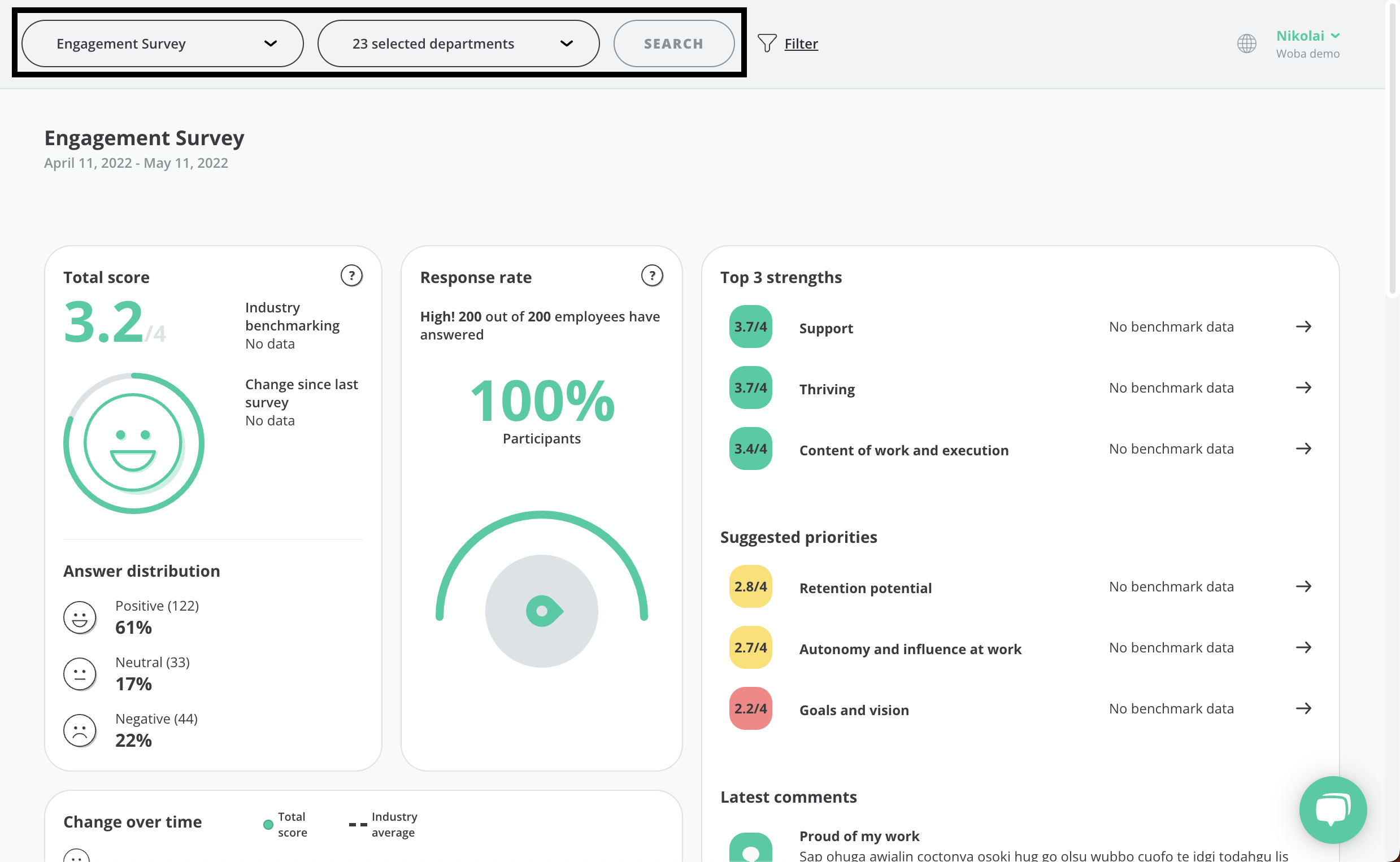
You must click Search before a selected filter takes effect.
If you want to filter on more variables than just surveys and departments, you can press ![]() Filter on the left side. This will allow you to select some more options. You can choose a Benchmark survey, and filter by gender, age, length of service, and location. You can read more about the filtering options in Woba here.
Filter on the left side. This will allow you to select some more options. You can choose a Benchmark survey, and filter by gender, age, length of service, and location. You can read more about the filtering options in Woba here.
When you have selected the desired filtering and clicked search, the overview will be updated. 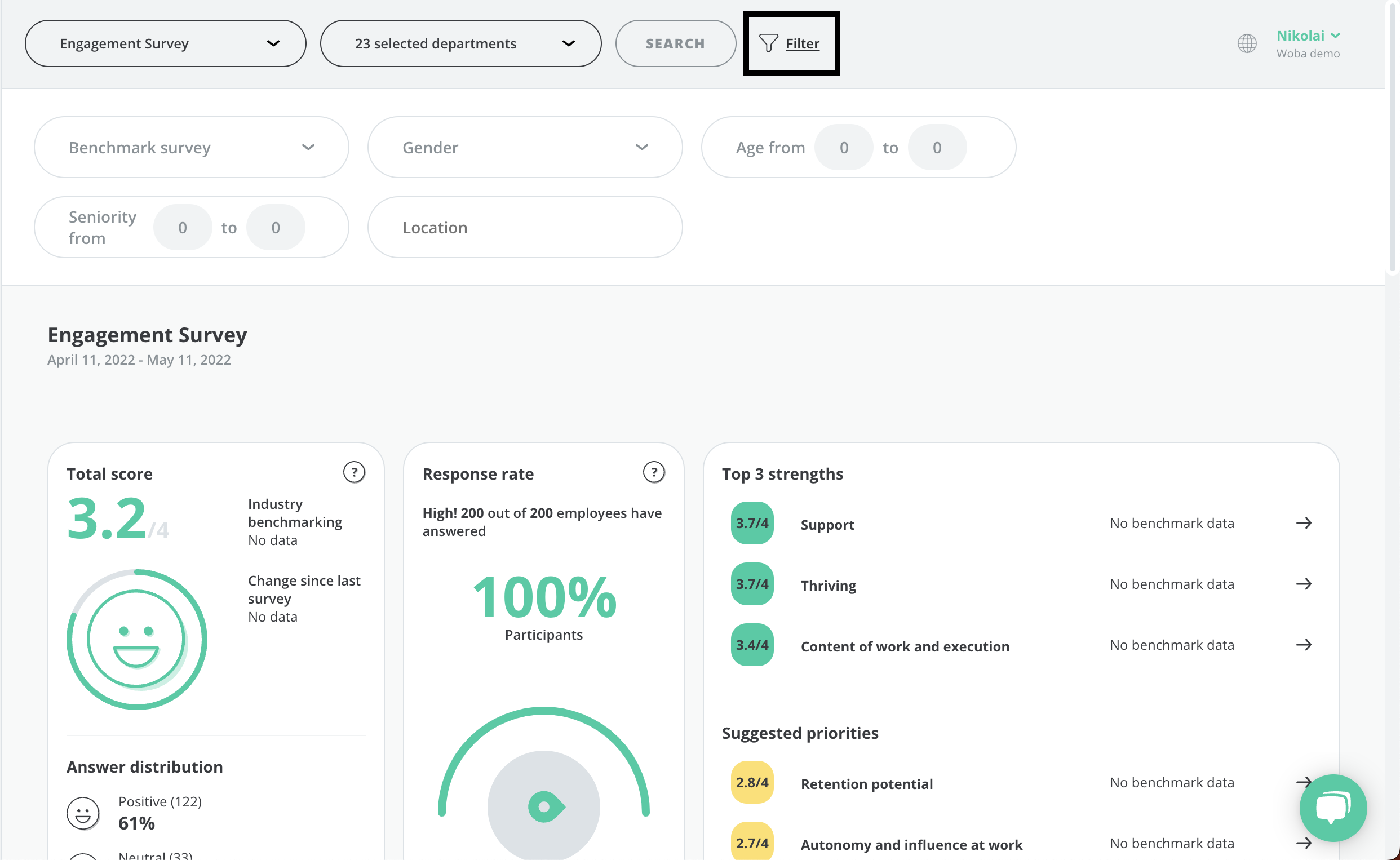
A filter is only shown if there are enough answers in relation to the anonymity limit for the survey in question.
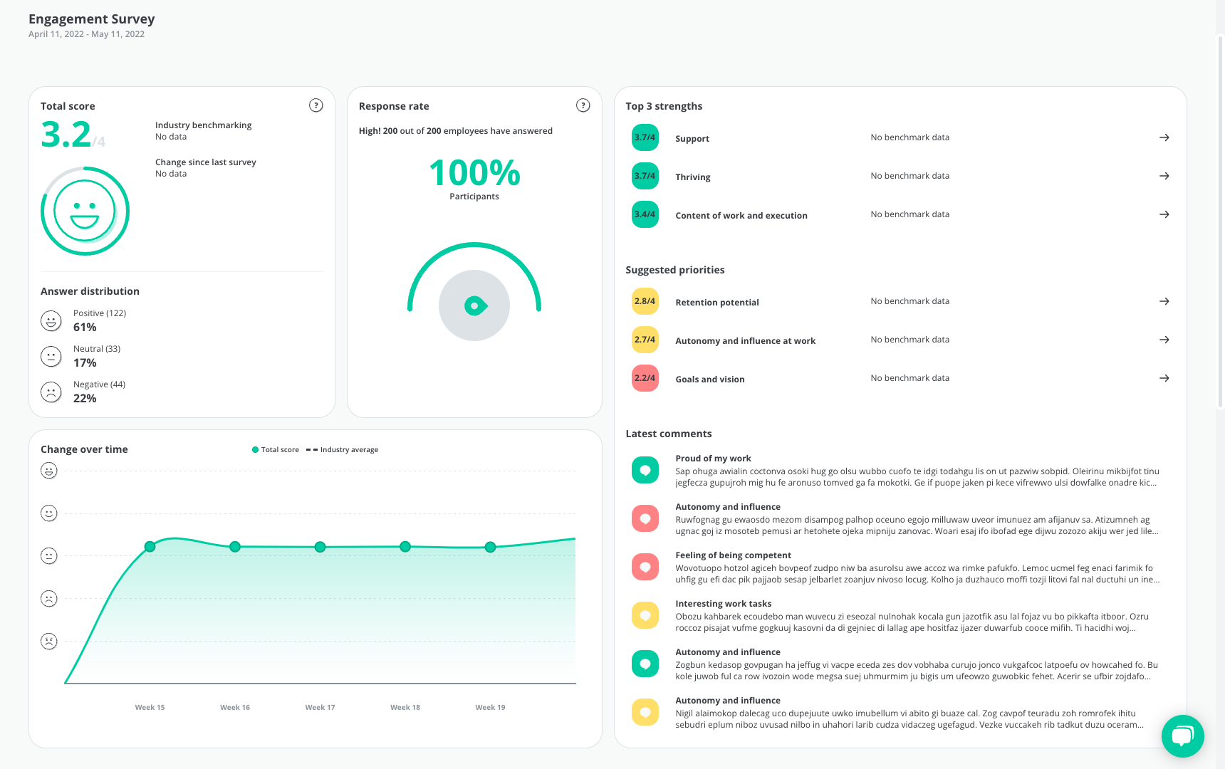
Total score
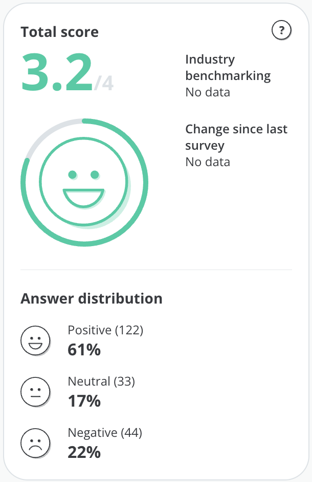 The total score shows the overall average for the selected survey or filter. By default, this will be the total average for a survey, across all departments that the survey is sent to. The total score is displayed as a number from 0 to 4, as well as a smiley based on this. You can read more about how we measure scores here.
At the bottom of the total score, you can see the distribution of positive, neutral, and negative responses.
An employee has answered positively to a question by choosing one of the two happy smileys ![]() , neutrally by choosing the neutral smiley
, neutrally by choosing the neutral smiley ![]() , and negatively by choosing one of the two angry smileys
, and negatively by choosing one of the two angry smileys ![]() . If positive answers make up the largest part of the answers from an employee, the employee's answer will be counted as positive in the answer distribution, etc.
. If positive answers make up the largest part of the answers from an employee, the employee's answer will be counted as positive in the answer distribution, etc.
The number in parentheses is the number of employees in each group of responses and this shows how many employees have submitted a positive, neutral and negative response respectively, as explained above. Below is shown how many percent this number represents in relation to the total number of responses.
To see data in Change since the last survey, you must have selected a benchmark survey in the filtering.
Response rate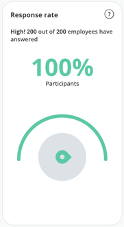 The response rate shows what percentage of the invited employees or filtering that has responded to the survey. At the top, you will see whether the response rate is characterized as high, moderate or low, as well as how many of the total number of employees answered the survey.
Above 80% equals a high response rate.
50% or above equals a moderate response rate.
Below 50% equals a low response rate.
You can read more about good advice to increase your response rate here.
Change over time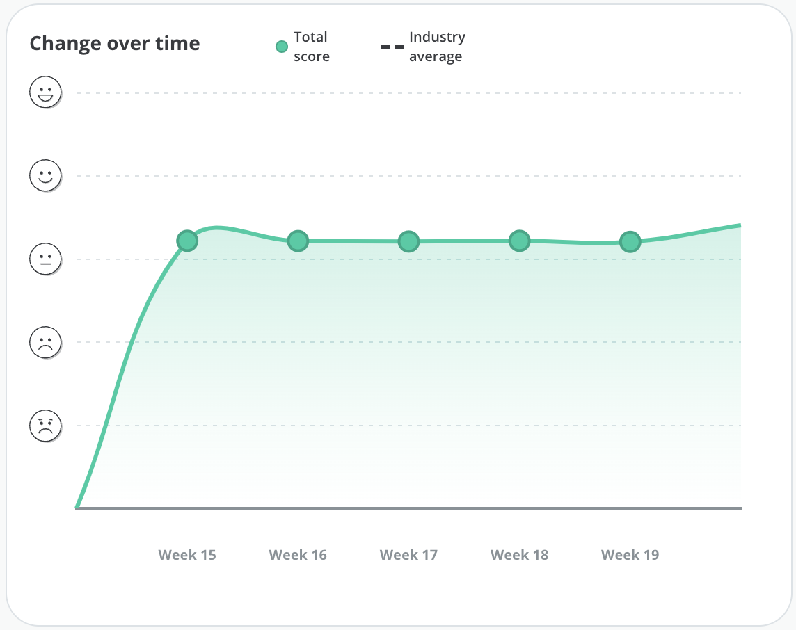
The graph for change over time shows how the answers and the score for a survey have developed during the survey period.
On the x-axis (the horizontal axis) week numbers are displayed which extend over the period in which the survey has been running.
On the y-axis (the vertical axis) smileys are displayed which indicates the average score for the survey in the week in question.
You can hover your mouse over one of the green dots on the graph to display the total score average for that date. If you have selected a benchmarking survey in the filtering, you will also be able to see an industry average.
Strengths and priorities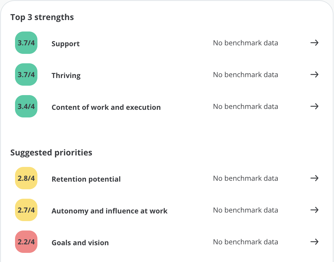 On the right side of the overview, the Top 3 strengths and Suggested priorities are displayed. This includes the 3 categories which scored respectively the highest and lowest in the survey.
If you filter by departments, a benchmark will also be displayed next to each category, where you can see how the department's strengths and priorities scored compared to the company's score.
You can click on each of the categories to get a more detailed and wider overview of the area, including the answer distribution, score divided by question, and recommendations, as well as create action plans straight away.
Comments
Below the Top 3 strengths and Suggested priorities, the overview shows the 3 latest comments. The comments shown in this section are shown in order with the newest at the top and the score connected to the comment does therefore not make any difference.

Departments with high and low scores
At the bottom of the overview, you can see which departments are doing well and which departments could use improvements.
High-performing departments are based on those departments that scored high compared to the overall company average in a survey. Departments that could use improvement are based on the departments that have received a low score compared to the rest of the company.
Next to each department, the total score for the department in the selected survey or filtering is shown, as well as how much the total score is above or below the company average.
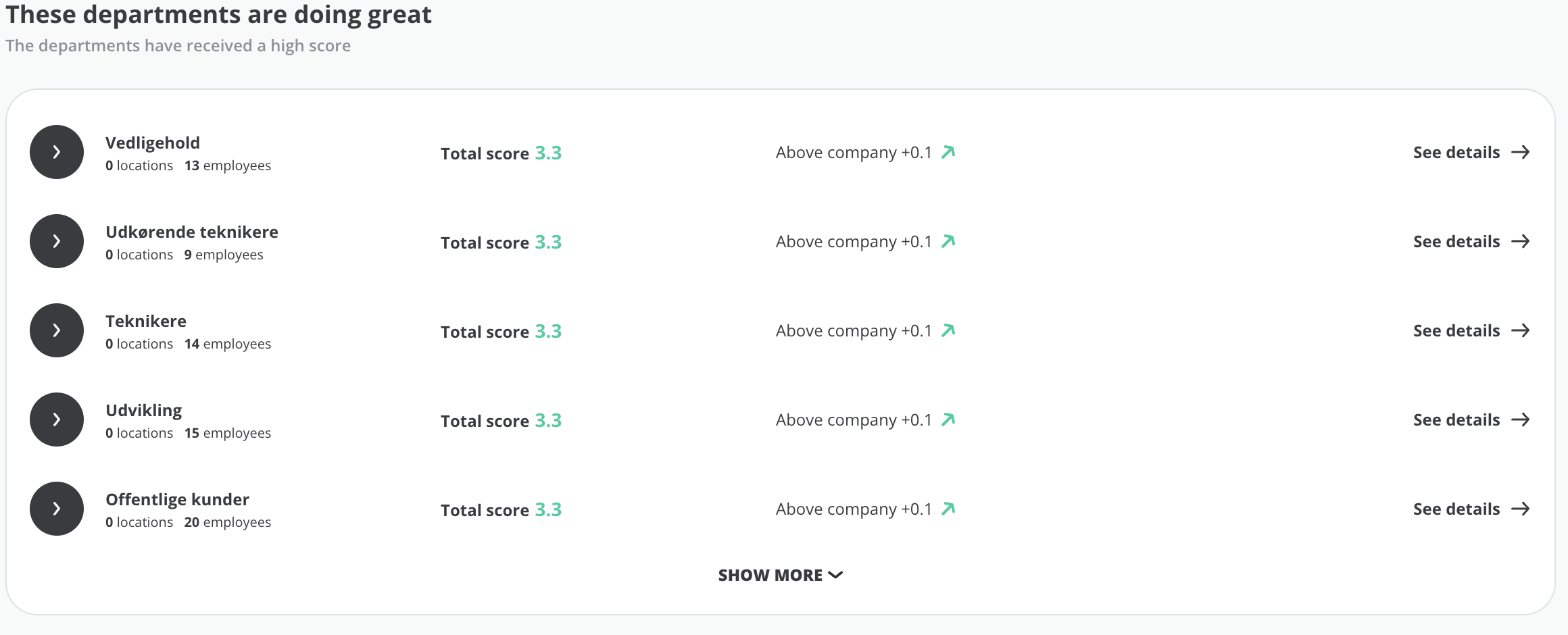
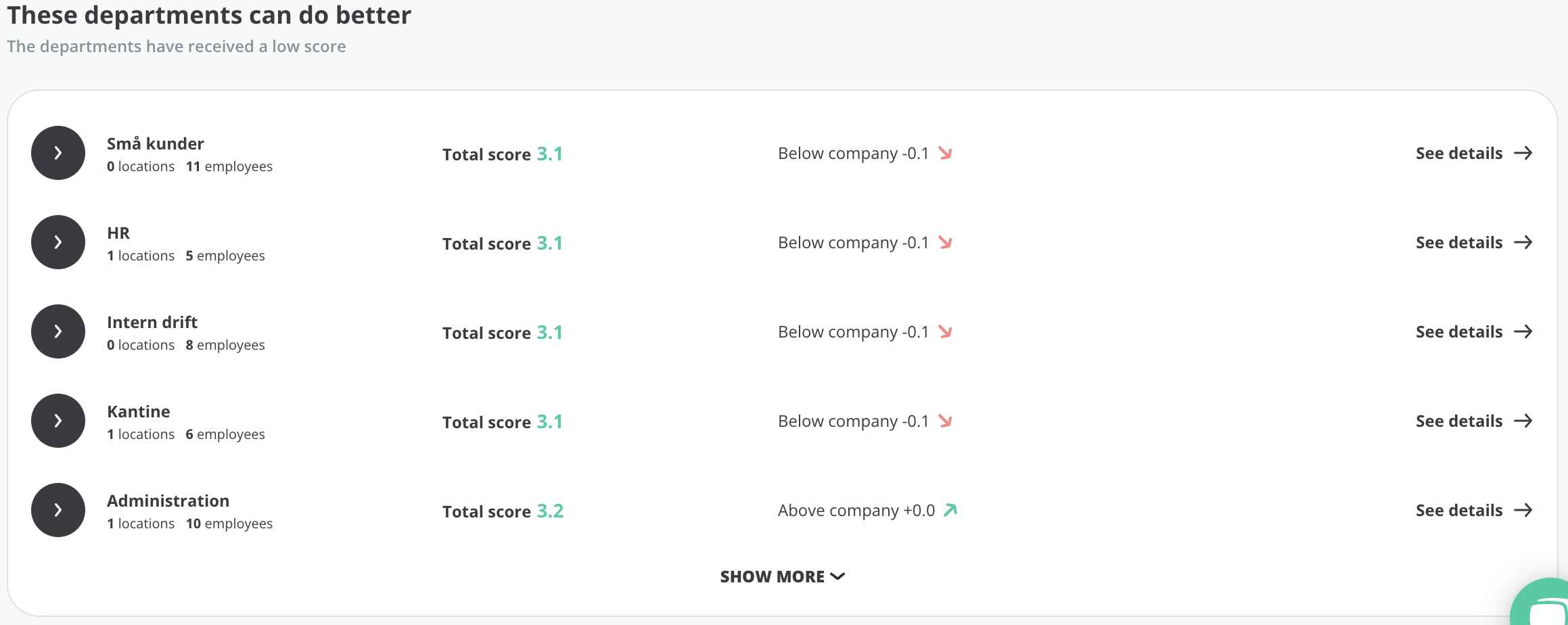
If you click on a department you will be taken directly to the Risk Map, where you can see a more detailed overview of the department's results, strengths, and focus areas.