
The overview is a tool that can be used to get a quick and comprehensible picture of a survey before diving into the details. This article will explain and elaborate on how to read and interpret the information in the Overview, focusing on the following points:
- Woba's 5-point scale
- Response distribution and percentage
- Change over time
- Benchmarking in the Overview
It is recommended that you read the introduction to the Overview and how we measure and calculate data before reading this article.
Woba's 5-point scale

Most surveys in Woba are rated on Woba's 5-point scale and displayed as a color-coded smiley or interactive field with an associated scale from 0-4. In the overview, this scale is used in the Total score, as well as to show how each individual department or category performs.
 A score in the range 0-2.5 is in the red category Priorities, which indicates that there are most likely conditions at the workplace or in the work that the employees are dissatisfied with.
 A score in the range of 2.6-3.0 is in the yellow Keep an eye out category, which indicates that there are conditions in the workplace that should be watched.
 A score in the range of 3.1-4.0 is in the green Strengths category, which should be understood as positive resources that promote employee happiness and productivity at work.
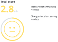
The number in the Total score should be understood as the total score for the entire company or the selected filtering. This score is displayed based on an average calculated for all questions and categories in the survey.
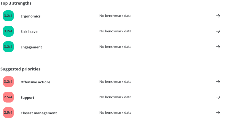
A score is also displayed next to the categories selected as Top 3 strengths and Suggested priorities. This score should be understood as the total score for the category in question. This means that the score for all questions belonging to the category is included.
Response distribution and percentage
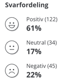
The score displayed in the Response Distribution is based solely on the number of employees who responded predominantly positively, neutrally, or negatively to a survey.
An employee has responded positively to a question by choosing one of the two happy smileys ![]() , neutrally by choosing the neutral smiley
, neutrally by choosing the neutral smiley ![]() and negatively by choosing one of the two angry smileys
and negatively by choosing one of the two angry smileys ![]() .
.
The percentage figure must be understood as the percentage of employees in the relevant category of the answer, and the number in brackets must be understood as the number of employees the percentages make up.
Change over time
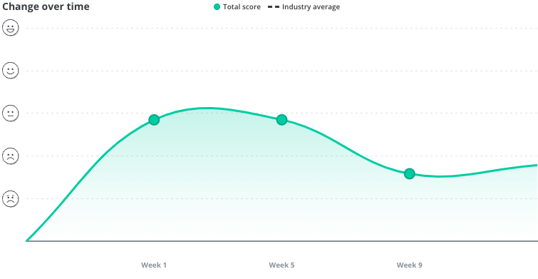 The graph of change over time creates a clear picture of the development of a survey. The x-axis shows the week number and the y-axis shows the total score for the time in question.
If you put the mouse over a point on the graph, the x and y values are specified. The date of the point is shown at the top and the total score at that time is shown below
Benchmarking in the Overview
You can select a Benchmark survey in the filtering. This provides a basis for comparison, such as making it possible to compare with previous results.
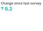 In the total score, you can see Change since the last survey when you have selected a Benchmark survey. This shows how much the total score has changed since the benchmark survey. It is also possible to compare with the average for the industry if there is data for this.
 You can also see the change since the last survey based on your top 3 strengths and suggested priorities. If you click one of these, you can also compare the score for each question with a previous survey.
![]() At the bottom of the overview, you can also benchmark the departments that are performing well or poorly with the company average. This is displayed next to each individual department. If you click on one of the departments, you will be taken to the Risk Map, where you can see the department's change since the last survey.
At the bottom of the overview, you can also benchmark the departments that are performing well or poorly with the company average. This is displayed next to each individual department. If you click on one of the departments, you will be taken to the Risk Map, where you can see the department's change since the last survey.