
Purpose of the 'Dashboard' Module in Woba
The Dashboard in Woba is your first stop when you need a clear understanding of wellbeing in your organization. It combines a quick visual snapshot with the ability to dive into the details – all based on your data and employee feedback. Use it to prioritize and get a clear overview before digging into specific categories or departments.
The AI Executive Summary helps you identify patterns and suggests concrete next steps based on your data – no data analysis skills required.
🎥 Video guide: How to navigate the Dashboard and AI Executive Summary
The video covers:
-
How to access and filter the Dashboard
-
How the AI Executive Summary can guide your next steps
-
How to identify and benchmark departments
🧾 Step-by-step: How to do it
🔍 Step-by-step: Using the Dashboard and AI Executive Summary
1. Log in and go to the Dashboard
When you log into the Woba platform, you'll automatically land on the Dashboard page, which gives you a full view of results from an ongoing or completed survey.
2. Use filters to customize the view
At the top, you can:
-
Filter by survey

-
Filter by department

-
Filter by gender, age, seniority, etc.

-
Select a Benchmark survey to compare over time

👉 Click “Apply and save filters” to activate your selections.
📌 Data is only shown if the anonymity threshold has been met.
3. Understand Woba’s 5-Point Scale
All scores in the Overview – e.g. total score, categories, and departments – are based on Woba’s 0 to 4 scale:
-
0-2,5 (Red): Priorities – areas with high risk and low wellbeing
-
2,6-3,0 (Yellow): Watch closely – potential risk zones
-
3,1-4,0 (Green): Strengths – areas with high wellbeing
😞 = low score → needs prioritized action
😐 = medium score → monitor
😃 = high score → positive resource
The Total Score is an average across all questions and responses within the selected filters.
4. Read the response distribution and response rate
Responses are divided into three groups:
-
Positive: 😃 or 😄 (score 3 og 4)
-
Neutral: 😐 (score 2)
-
Negative: 😞 or 😡 (score 0 og 1)
You can see both the number and percentage of responses in each category and for each question.
The response rate shows how many of the invited employees have answered:
-
80%+ = high response rate
-
50-79% = moderate
-
Under 50% = low
💡 Tip: See guide to increasing your response rate here [insert link].
5. Use prioritized focus areas to guide your efforts
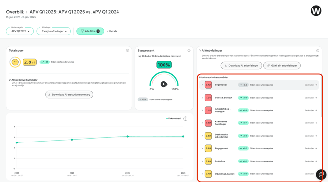
On the right-hand side, you’ll see a list of your categories:
- Sorted by what requires the most attention
- With the option to expand and view related questions
- If you’ve selected a benchmark, you’ll also see changes over time
📈 The score shown is an average of all questions in the category.
🔍 Click on a category to view all related questions and dive deeper.
6. Use AI Executive Summary to take data-driven action
Click on a risk area or a low score to get an AI-generated summary including:
- An explanation of the underlying data patterns
- Suggestions for actions
- Support for next steps, such as creating an action plan
🤖 Executive Summary helps you understand why the score looks the way it does — and what you can do about it.
7. Identify strong and vulnerable departments
At the bottom of the Dashboard, you’ll see:
-
Departments scoring above the company average
-
Departments with low scores = potential red flags
-
The number of action plans created per department
-
The option to send a reminder to department managers
🟢 High score → benchmarked above average
🔴 Low score → benchmarked below average
📍 Click a department to open the Risk Map and get detailed insights, changes since the last survey, and recommended next actions.
💡Tips for Use
- Use benchmark comparisons to spot trends over time
- View both category and department levels for a complete picture
- Combine the Dashboard and AI Executive Summary for insight and action
- Remember: The Total Score is an average — also look at response distribution and comments
- See changes since the last survey under categories and departments
❓ Frequently Asked Questions
How is the total score calculated?
→ It is the average of all employee responses within the selected filters, calculated based on Woba’s 5-point scale (0-4).
How does the benchmark feature work?
→ Select a previous survey in the filters. You will then see changes since last time in the total score, categories, and departments.
How do I interpret the smiley icons?
→ 😃 = Strength, 😐 = Watch, 😞 = Prioritize action.
Can I see changes since last time at the category level?
→ Yes. Under Recommendations, changes in scores are shown when a benchmark is selected.
How can I track department progress or setbacks?
→ At the bottom of the Dashboard, changes in scores relative to the benchmark are shown — click for details in the Risk Map.
🔗 Related Articles
- [What is AI Executive Summary?]
- [How to Create an Action Plan]
- [How to Use Risk Map to Spot Red Flags]
- [Understanding Anonymity and Data Protection in Woba]
- [Guide to Increasing Response Rates]
✅ Checklist Before You Proceed
✔️ Have you selected the relevant survey and benchmark?
✔️ Have you reviewed the response distribution and AI recommendations?
✔️ Have you identified key categories and departments?
✔️ Have you created action plans or followed up on existing ones?
📅 Last updated: July 28, 2025
📞 Need help? Contact us at support@woba.io or use the live chat in the bottom right corner.
🌍 Want to read this article in Danish? Click here: → Overblik & AI Executive Summary – Forstå medarbejdertrivsel (DK)