
 When you have downloaded a report in Woba, the data from your survey is set up in a presentable and comprehensible format. This article will explain how to read the report and understand its data with the following points:
For questions regarding data, calculations etc. Julian Raymond Blok can be contacted directly at jr@woba.io.
If you have not yet downloaded a report for your survey, you can read more about how to do it here: → Download reports with results
The front page
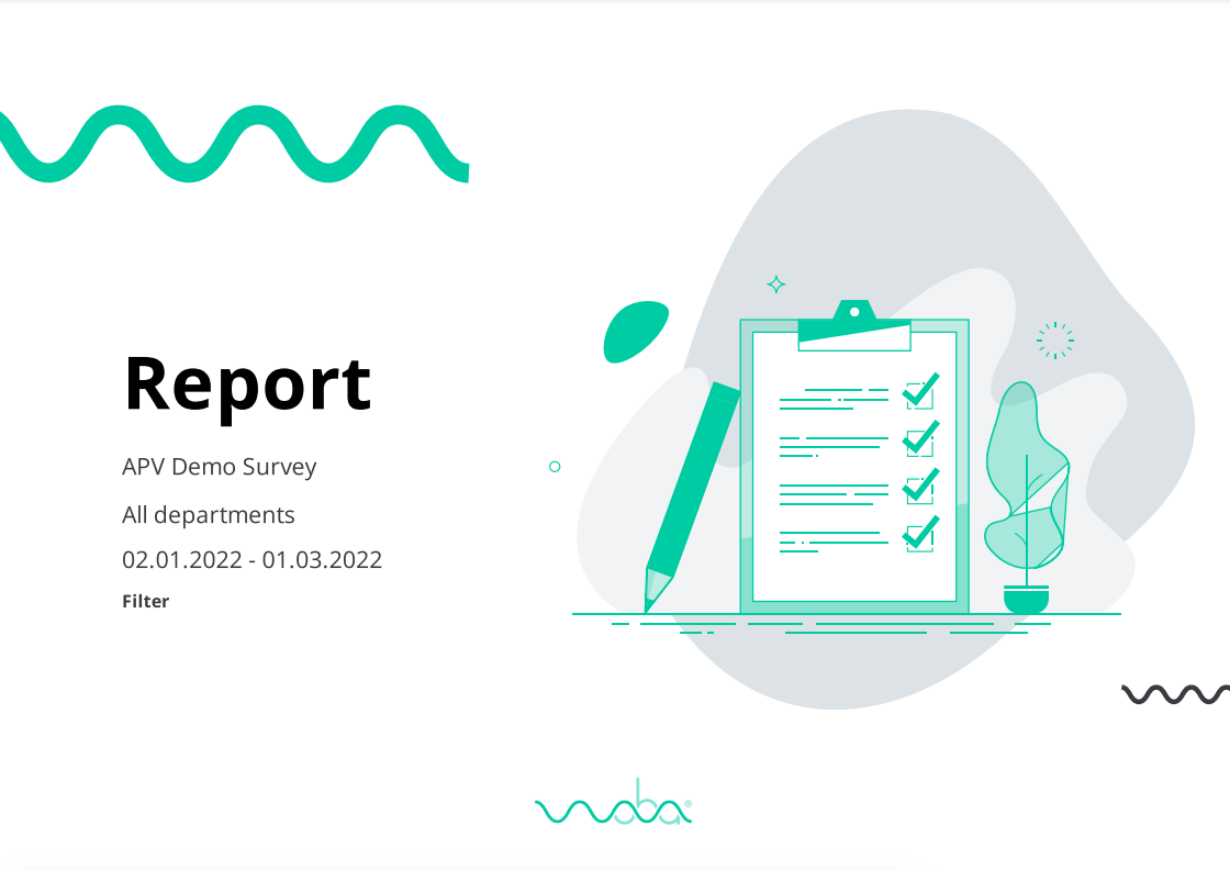
When you open the report, you are greeted by a front page as in the image to the right. On the front page, you have the company and survey name, which departments' data is included in the report, and which period the report covers.
You can change which data is included in the report in the filtering menu in Woba Analytics.
Total score and response rate
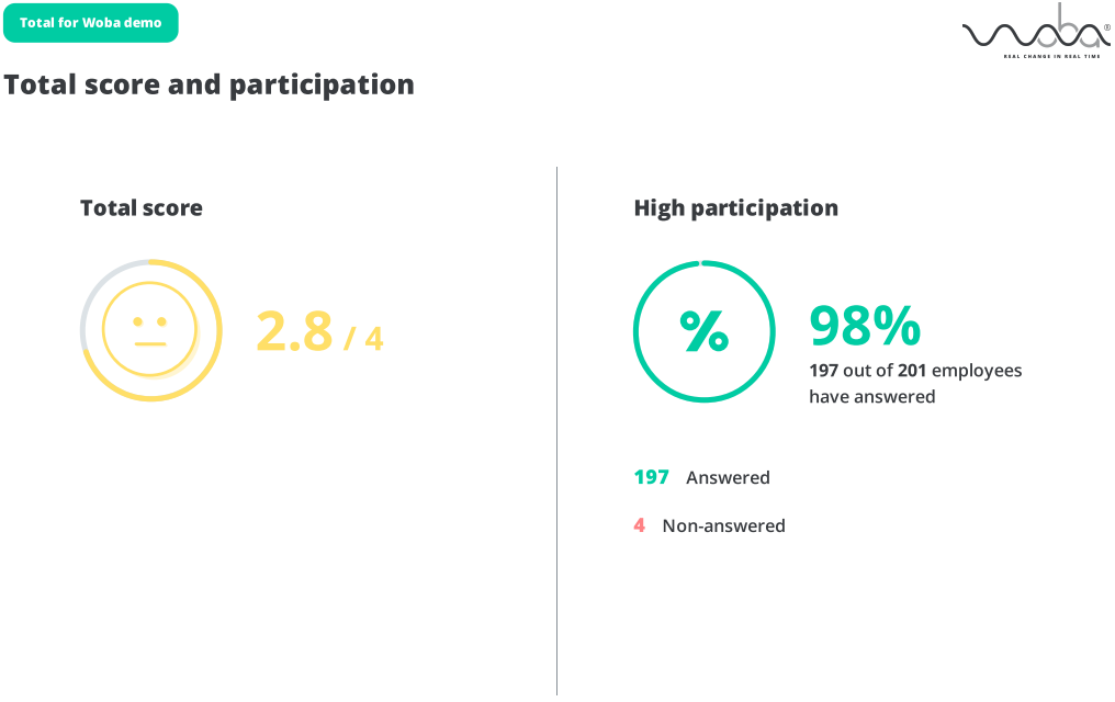 After the front page of the report, you have a quick overview of the total score and response rate for the departments in the survey, before diving into the results on the following pages.
The total score is based on all categories and questions in the survey and the response rate is based on all employees who have submitted a response.
Results from categories
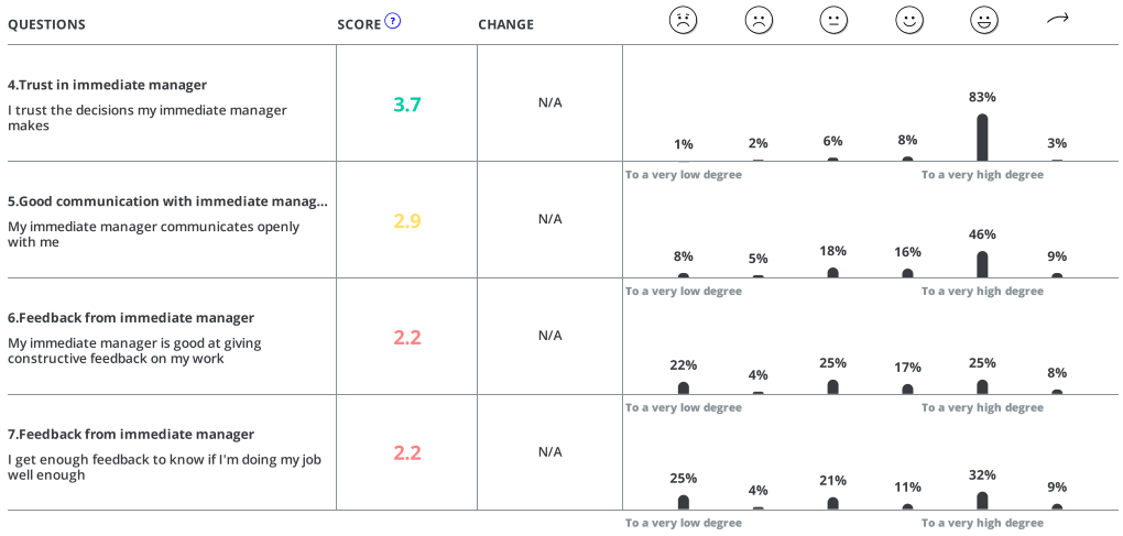
On the remaining pages of the report, the results are broken down into categories and questions.
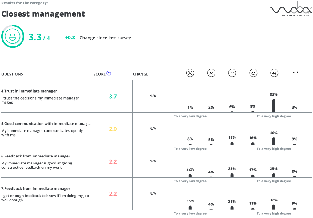 On these pages, you see two types of data.
- Category-level data in the form of an overall score and smiley
- Question-level data in the form of a table with various information.
The two types of data are elaborated on below.
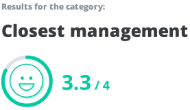
In the left corner, you have a total score for the overall category. This score is based on an average from all questions for the category.
If you have selected a benchmark survey, you can also see the change since the last survey for the category.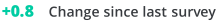
You can read more about benchmarking in Woba here: → Filtering options in Woba
Below the overall score for the category is a table that shows the underlying data from the overall result. Each column in the table is explained below.
If you are interested in the explanation behind the data you see in the report, you can read more about how we measure and calculate data here: → How we measure and calculate data
Question
In the first column of the table are the questions from the category that have been questioned about in the survey. Only questions included in the calculations are in the report.
Score
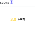
Next to each question is a color-coded score. This number is a total score based on all the answers to the question. The score and color code are based on Woba's standard 4-point scale. If you have generated a report that does not cover the entire company, a number will be displayed in parentheses next to the score. This number indicates how much the score is above or below the score for the entire company.
Change

If you have chosen a benchmark survey, you can see the change since the last survey in the column next to the score for the question. The change is only shown if the survey has the same questions as in the benchmark survey.
Answer distribution
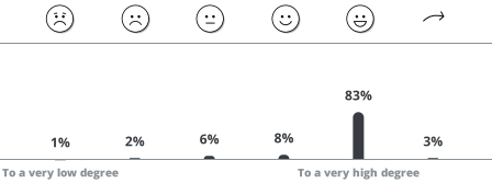 In the last column, you have a diagram of the answer distribution. The answer distribution shows what percentage answered each individual answer option. If an employee has skipped a question, you can see it by the percentage next to the
  skip icon.