

This article is a guide to how we measure and calculate survey data in Woba, as well as how the different scales should be interpreted. The following scales are explained in detail:
-
Total Score
-
Response Distribution
-
Employee Net Promoter Score (eNPS)
-
Aggregated Score
There are three different types of scores available in Woba Analytics: the total score, a score based on the response distribution, and the Employee Net Promoter Score. This article explains and elaborates on how to interpret these three measures.
For questions regarding data, calculations, or similar topics, please contact Julian Raymond Blok directly at jr@woba.io.
Total score
The total score gives you an overall overview of the wellbeing level in your organization. The scales vary:
-
5-point scale (0–4) – for example: 2.95 rounds to 3.0; 2.445 to 2.4.
-
0–10-scale – provides a broader picture
-
eNPS (–100 til +100) – used when measuring engagement is particularly relevant. Typically based on no more than one question.
Color coding (5-point scale):
-
Red: 0–2,5
-
Yellow: 2,6–3,0
-
Green: 3,1–4,0
Purpose: A nudge towards action – green indicates strengths/resources, while red points to risk areas.
When employees answer a survey using the 5-point scale, they can choose between 5 different smileys, each linked to a value from 0–4. Thus, 0 corresponds to the most dissatisfied smiley, while 4 corresponds to the happiest smiley.

Based on these smileys, an average Total Score is calculated, which is then displayed as one of three smileys, depending on the average value:
😫 Red 0 to 2,5 😐 Yellow 2,6 to 3,0 😁 Green 3,1 to 4,0
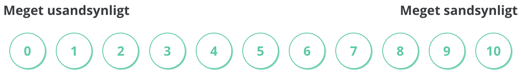
0-10 Point scale
When answering the survey, a scale from 0 to 10 is used, where 0 represents the most negative assessment and 10 the most positive.

Based on this scale, an average Total Score is calculated, which is then displayed as one of three smileys, depending on the average values:
😫 Red 0 to 3,9 😐 Yellow 4,0 to 6.9 😁 Green 7.0 to 10
![]() The green category Strengths should be understood as positive resources that promote employee happiness and productivity at work.
The green category Strengths should be understood as positive resources that promote employee happiness and productivity at work.
The yellow category Keep an Eye On indicates that there are aspects of the workplace that should be monitored.
The red category Priorities indicates that there are most likely aspects of the workplace or the work itself that employees are dissatisfied with.
Tip: You can see how to access research-based recommendations for your company’s risk areas here: → Get recommendations
Response Distribution
This shows the proportion of employees with positive, neutral, or negative responses.
-
Positive: the 2 happy smileys
-
Neutral: the middle smiley
-
Negative: the 2 unhappy smileys
The response distribution provides an overview of the group’s overall wellbeing, independent of a numerical score. Below is an example of how the response distribution from a survey with 200 responses can be interpreted:
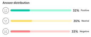
Note: The response rate and the underlying figures used for the response distribution are rounded to make the overview easier to read. Therefore, the percentages do not always add up to exactly 100%, and the number of employees in parentheses may not always match the total number of responses in a given survey.
Employee Net Promoter Score (eNPS)
Measures employee loyalty with a single question:
"How likely are you to recommend your workplace to others?"
Categories:
-
Promoters (9–10)
-
Passives (7–8)
-
Detractors (0–6)
The total eNPS for the survey is calculated on a scale from –100 to +100 and is determined as the percentage of promoters minus the percentage of detractors, as shown in the formula below:
eNPS = Promoters (%) - Detractors (%)
The scale helps with internal benchmarking. Examples: +50–100 = excellent; –40––100 = poor
A score in the range –1 to –39 is displayed as a yellow neutral smiley:
A score in the range –40 to –100 is displayed as a red unhappy smiley:
Tip: You can read more about how to conduct an eNPS survey here.
Aggregated Score
A hierarchical “roll-up” of results at a higher level (e.g., main department), combining all underlying units in the selected group/view. The function can be toggled on or off.
The score is recalculated based on all individual responses within your filters and time period — not as an average of departmental averages. For example:
In the first image, we see four selected parent departments. Each parent has a number of sub-departments, each with its own score.
If you want to see how each cluster of departments has performed as a whole, you can use the aggregated score. This way, each parent department will have the scores of its sub-departments rolled up into a single overall score, giving you an overview of the total results at each location.
Proactive Value in Woba
By understanding and acting on the results (e.g., through action plans or dialogue), you create a workplace where stress, sick leave, and loss of talent can be effectively prevented. Reach out to Support@woba.io if you have any questions.