Updated Frontpage and filters "👍"
Design upgrade and improved filter function
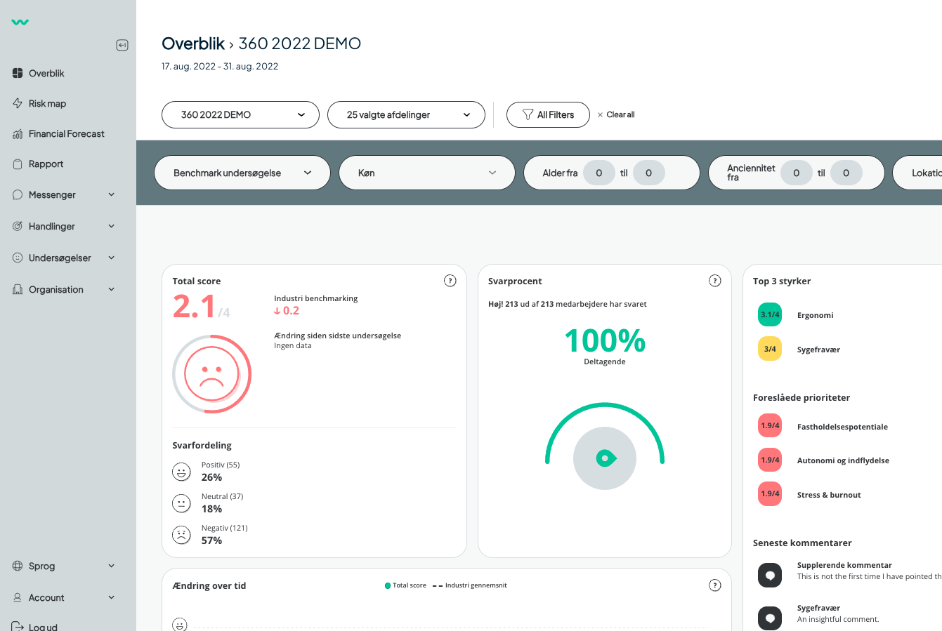
We have made a design upgrade and improved our filter function so they are more intuitive to use.
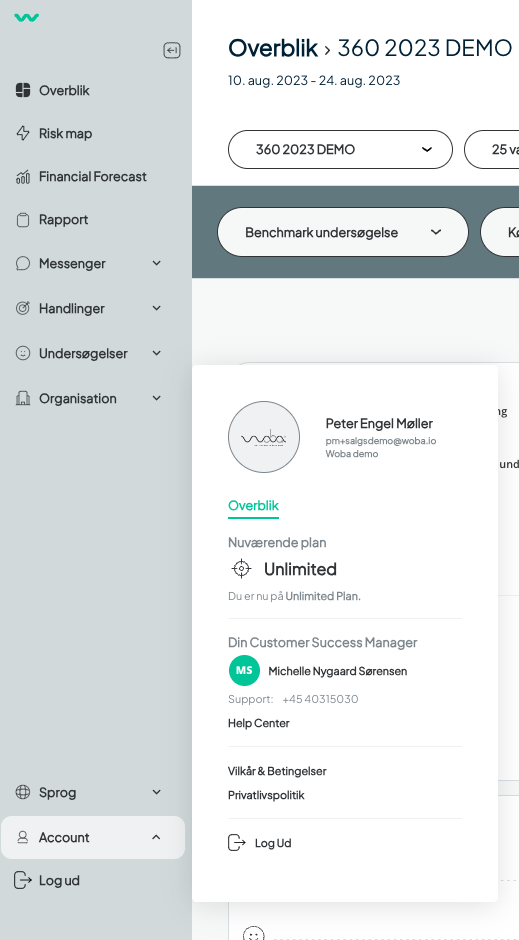
At the same time, we have moved the Account info and language down to the left-hand corner.
Big news – we've spruced up Woba's analytics interface to make it even more user-friendly and sleek.
What's New in Admin: We've made some changes to the admin tools:
- Account settings
- Language preferences
- Log-out option
You'll find these options now neatly tucked in the lower left corner of the side navigation menu.
Easier Filters:
Filtering results just got simpler. Check out the video below to see how it works. From now on, all you need to do is pick the filters you want, hit "Apply," and watch your results appear right away on the user interface. It's quick and intuitive.
corner.
