
All the colored fields in the Risk Map are interactive fields, which means you can click on them to dive into the data underlying the score.
You can see two types of data when you dive into the Risk Map. This article will elaborate both:
- Score divided by category
- Total score by category
- Response distribution by category
- How is the response distribution calculated?
- Score divided by question
- Total score on a question level
- Answer distribution on a question level
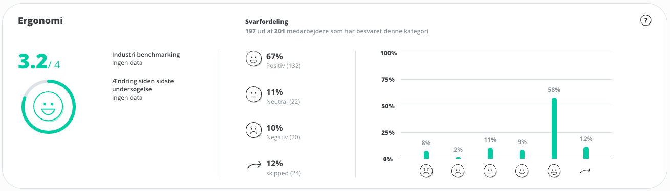
Score divided by category
Total score

When you tap on a field in the Risk Map, you will be shown the underlying data for the category. At the top, data based on the overall category is displayed.
On the left, the total score for the category is displayed, with an associated smiley. This score is based on the entire company.
If you have selected a benchmark survey in the filtering, comparison data will be displayed under Change since last survey.
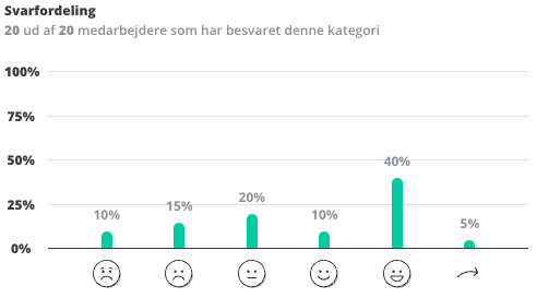
Answer distribution
The response distribution shows the distribution of positive, neutral, negative, and skipped responses to the questions of the category.
The percentage is measured at a response level and is based on how many responses to a question have been submitted for each distribution compared to the total number of responses to questions in the category.
The number in brackets is measured at an employee level and is based on how many employees the number of responses in the distribution corresponds to. This number is always rounded to the nearest whole number.
How is the response distribution calculated?
In the following example, there are 5 questions, and 10 employees answer the questions. In total there are 5*10 = 50 answers to submit.
If an employee answers 1 question negatively, but the remaining 9 employees answer all questions positively, the total will correspond to 1/50 = 2% negativity. But since each employee has 5 answers to give, there must be 5/50 = 10% negativity before there is 1 negative employee.
This means that there can be a negative percentage in the response distribution without necessarily beeing a negative employee.
Tip: you can read more about how we measure and calculate data here: → How we measure and calculate data
Score divided by question
Further down the page you can see the score and answer distribution for each individual question in the category.
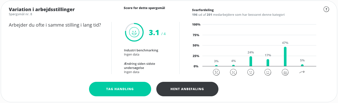
On the far left, the subcategory to which the question belongs is shown, which question number in the survey it is, as well as the question itself for which data is displayed.
Total score
In the middle, the total score for the question, based on all employees, is shown. If you have selected a benchmark survey in the filtering, comparison data will be displayed under Change since last survey.
Answer distribution
 The right-hand side shows the answer distribution for the question. You can see the percentage that has answered the different answer options or skipped the question, as well as how many employees answered the question in total.
Tip: for each question, you can download recommendations and create action plans directly.